 I don’t know if any of our current readers were with us back in the Mudhunny days of 1998 but if you were, prepare for a trip down memory lane. Here, for the first time in 10 years is the original Mudhunny website, the precursor to our current site here at singletracks.com. As you click through the site you may notice that some of the original trail descriptions are still used on the current site (including some pretty terrible trail photos as well). The site was hosted for free on Geocities.com (in the Yosemite “neighborhood” I believe).
A few things I’ll point out that may not be apparent to the untrained eye:
1. The homepage is essentially blank. I’m not sure why or what we were thinking at the time, but I can assure you that the Mudhunny website did in fact have something on the homepage. I know that at one point we had a cutout of the southeastern states we covered that looked something like this (though this version came a bit later):
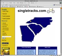
2. Even back in 1998 we had trail photos! I don’t know if any of the other MTB sites were doing this at the time but we would often take a disposable film camera with us whenever we rode a new trail. After waiting weeks to develop the film (!) we’d scan each pic and post it on the site. Ah, the good old days 😉
3. Mudhunny also boasted maps, though not the kind that are particularly helpful for finding anything or navigating. We used a scanned road map for each region and plopped some numbers in the approximate locations of the trailheads which again, was fairly high tech for those times. Today we’re revisiting the idea with our free Metro Map series (below).
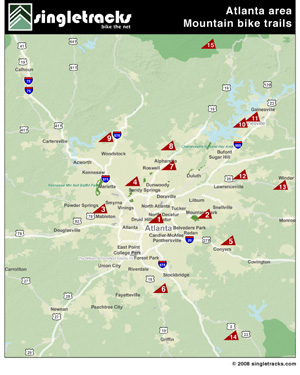
4. The site was completely static (that is, there was no way for members to submit new content). In fact we didn’t have any members except ourselves. This summer we expect singletracks.com membership to exceed 50,000 riders from around the world!
5. The fonts we chose were pretty terrible. The basic text is Courier font (not sure why no one uses that one these days 😉 ) and the fancy titles and links use a Mac-specific font called ‘Gadget’ that was all the rage among Mac-heads in the late 1990s.
It’s pretty crazy to think about how much has changed since the first Mudhunny site hit the ‘net and we’d love to hear what you think about the original site. Next up we’ll let you know how singletracks.com came to be and how we made the jump from southeastern US trail coverage to international MTB resource.





0 Comments